OVERVIEW
Timeline
4 weeks, Fall 2021
Team
Anujin Chimedochir, Hani Chang, Mia Chi Vu
Contributions
Branding, Visual Design, Website Design, Copywriting, Event Planning
Tools
Figma, Carrd (site builder), Google Drive Suite
Deliverables
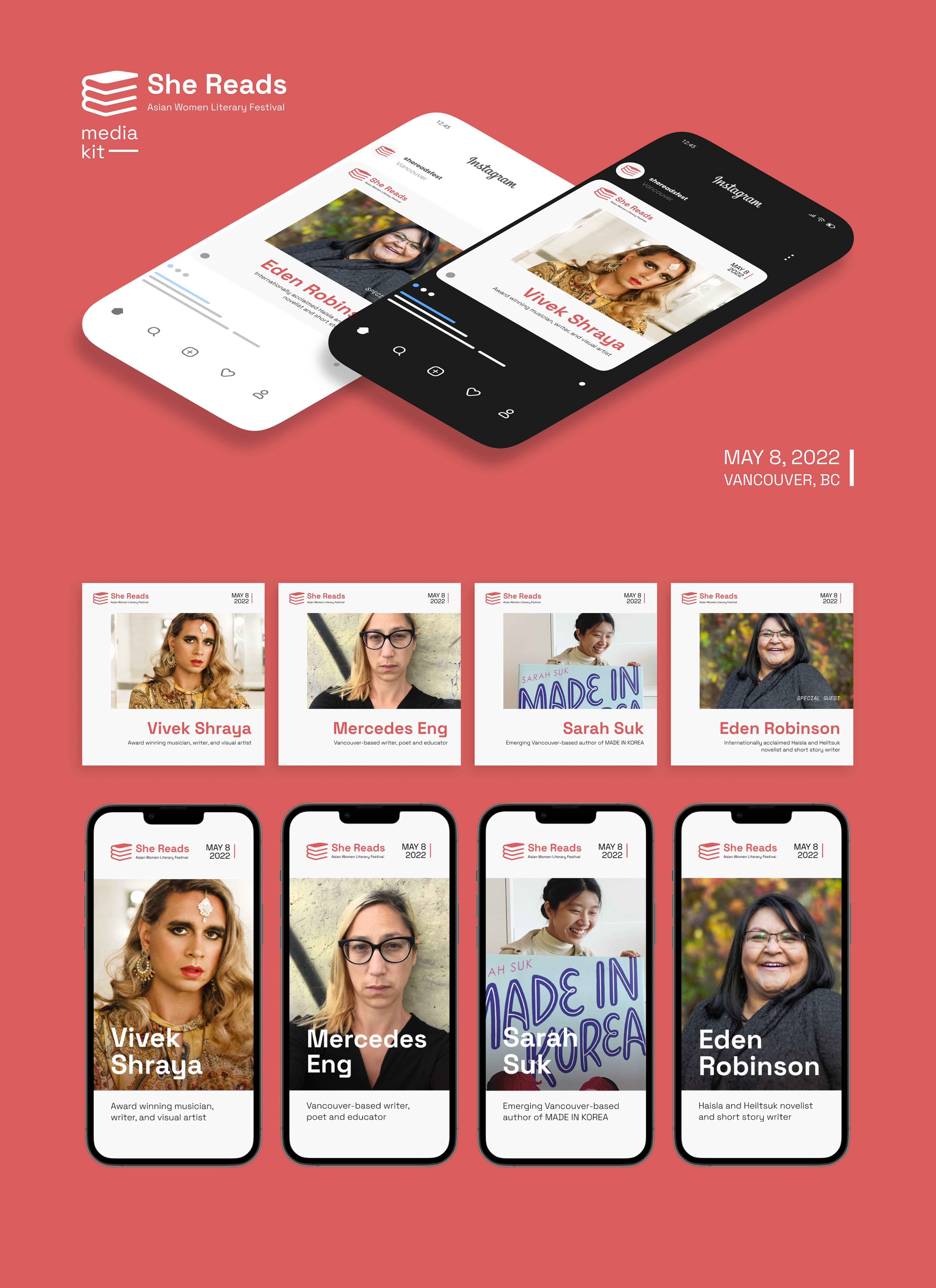
High fidelity festival website with real copywriting and images, 2 graphic templates, 8 sample social media posts, marketing plan, event budgeting sheet
WHAT IS SHE READS?
She Reads is a fictional one-day, in-person literary festival celebrating Asian-Canadian women in literature and publishing, in light of anti-Asian hate crimes that occurred increasingly during the rise of the COVID-19 pandemic. The festival features film screenings, novel and poetry readings, panel speaker sessions, and a networking event in which attendees are given an opportunity to connect with the authors.
The final deliverable of this academic project was to create a literary festival or event, a budget, a marketing plan, and a website that contains all information related to the event as proof of concept.
OBJECTIVES
Within my team, I was responsible for designing the festival's visual assets, including the logo, colour palette, social media templates, and building a functional website that acted as the information hub for attendees. In addition to design, I was also responsible for developing the She Reads festival marketing strategy, researching and sourcing manufacturers for branded materials, and finalizing promotional marketing related costs for the event budget.
PART 1 — Branding & Identity


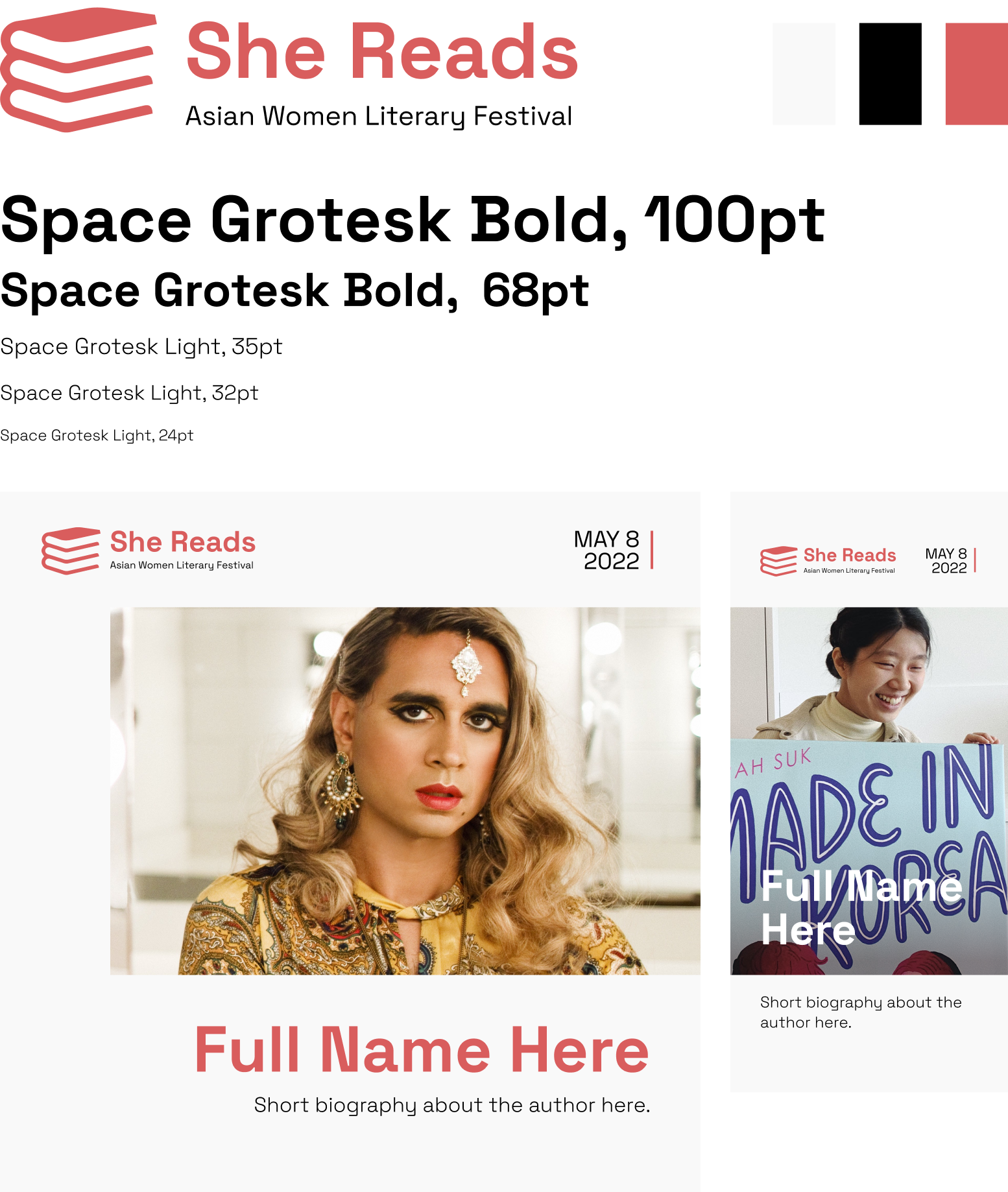
The branding of She Reads was meant to feel feminine, clean, and modern. The festival celebrates Asian-Canadian women from various Asian diaspora, featuring authors Vivek Shraya, Mercedes Eng, Sarah Suk, as well as special guest Eden Robinson who is of the Haisla and Heiltsuk First Nations. Among the cultures of our featured authors whose heritage come from India, China, Korea and Canadian First Nations, a common theme is that the colour red represents connection, prosperity, courage, and passion. As such, the festival branding used a light red to draw from these cultural associations while being softer and feminine in combination and contrast to the white, light grey, and black in the palette.
Space Grotesk was selected as the festival's typeface for visual assets due to its modern feel, proportional geometry and high legibility even at non-display sizes, as well as its support of Latin Vietnamese, Pinyin, and all Western, Central, and South-Eastern European languages.
PART 2 — Website Design
The website acts as an information hub for all things relating to the She Reads festival. As such, ensuring that important content would be surfaced in a logical order was crucial so potential attendees would not have trouble navigating and looking for the details they may be looking for. For the site, the typeface selected is Inter, a variable family that is known for high readability on digital screens.
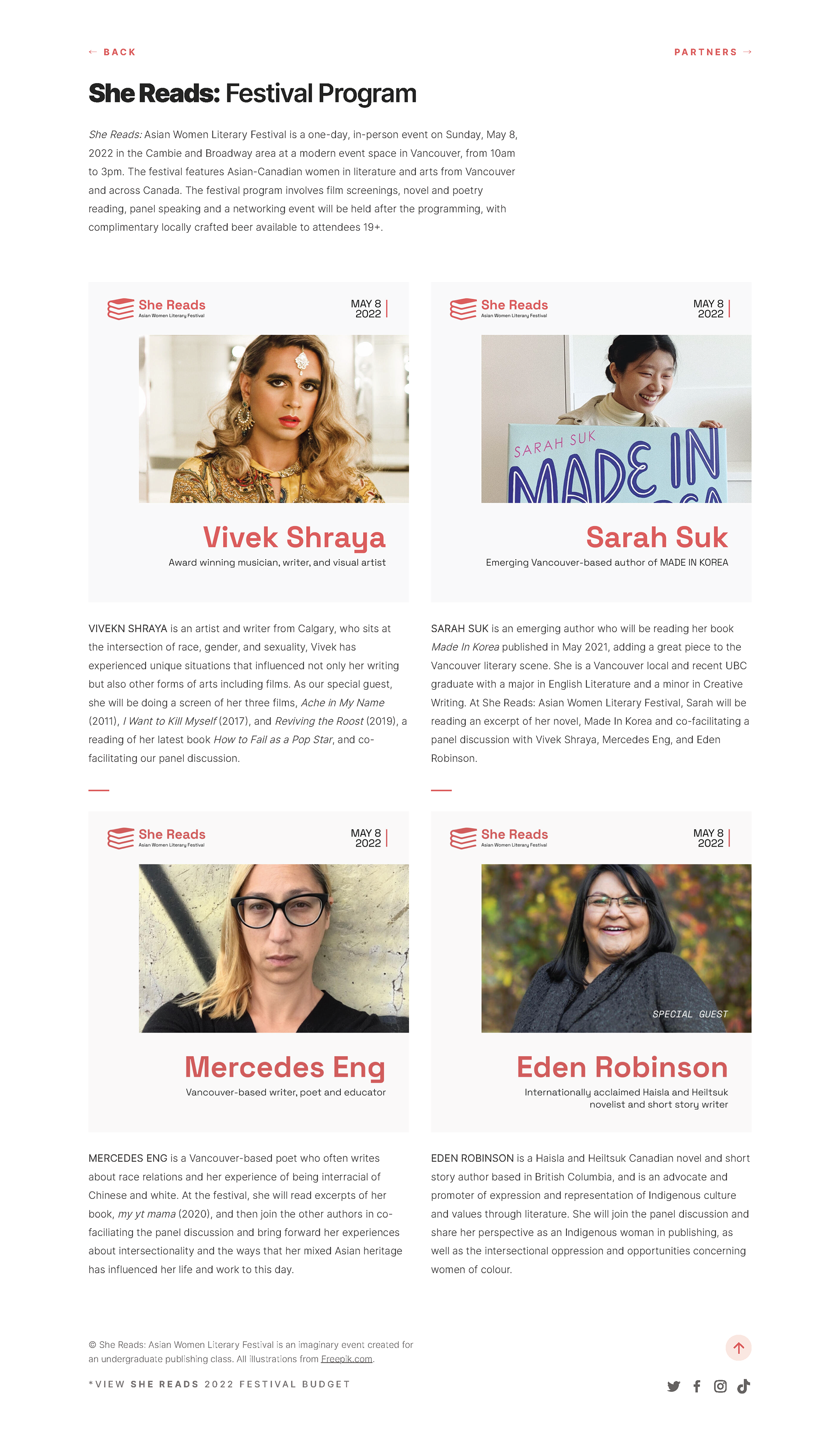
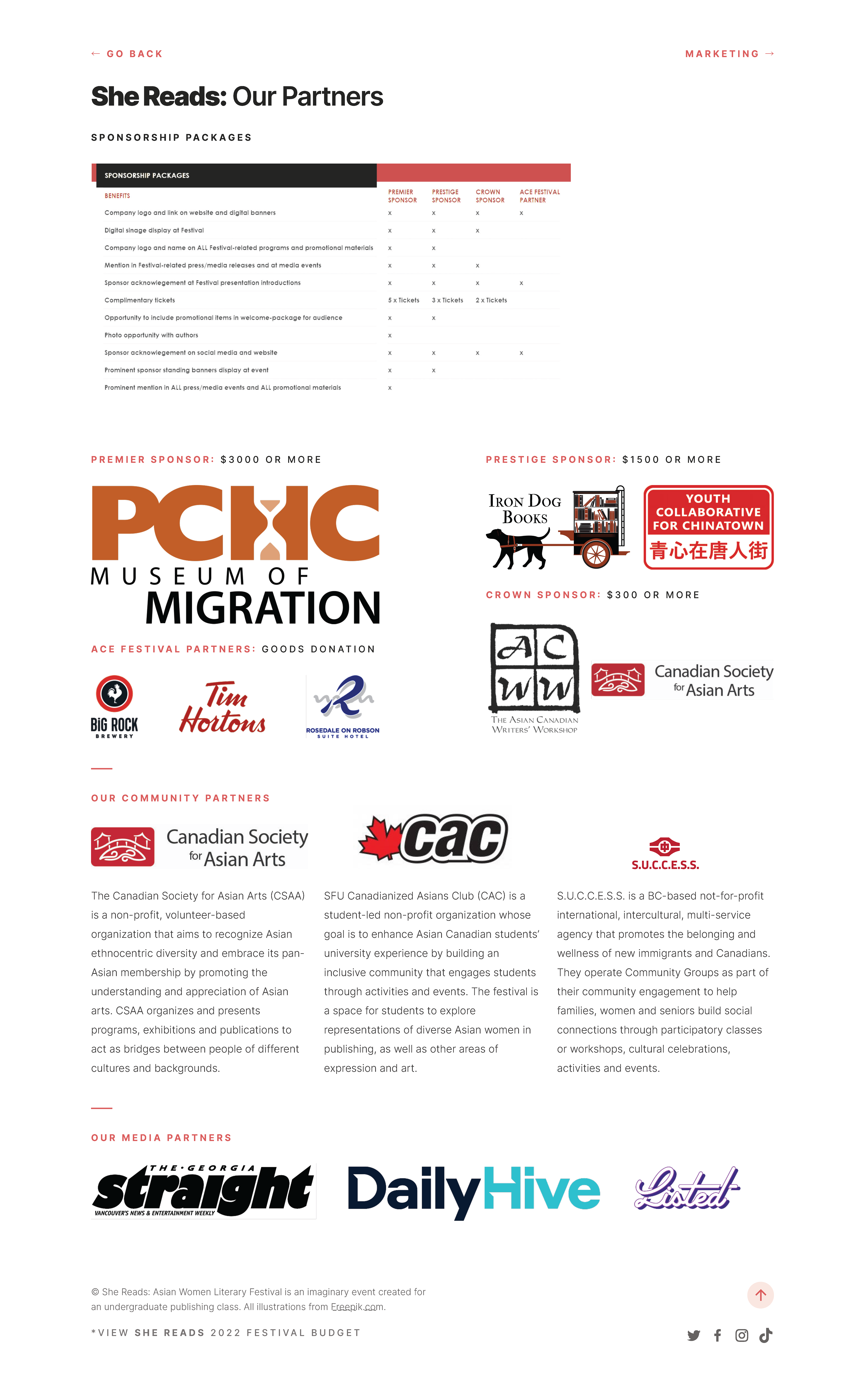
Below are a selection of pages from the She Reads festival website, and the full site can be viewed here.

Home Page

Program Page

Festival Partners Page
REFLECTION
This was the first project I had worked on from end-to-end, from research and ideation with my team, to exploring branding, designing a website, looking into branded merchandise, developing marketing strategies and even working on a budget. Having worn many hats, I got a taste of working across different teams, and designing for a larger scale event, which overall taught me about staying organized and improved my ability to multitask on a tight deadline. If I had more time, I would have liked to take the site in a more complex and engaging direction compared to the existing site, but overall it was a fulfilling project to design.