Context — Spring 2023, Academic, Capstone
Team — Erika Wang, Hanna Luu, Mark Robles
Contributions — UI Design, Icon Design, Game Design
Tools — Figma, Procreate, Adobe Illustrator
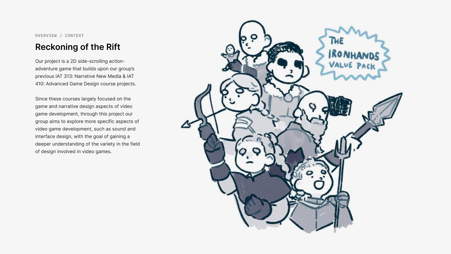
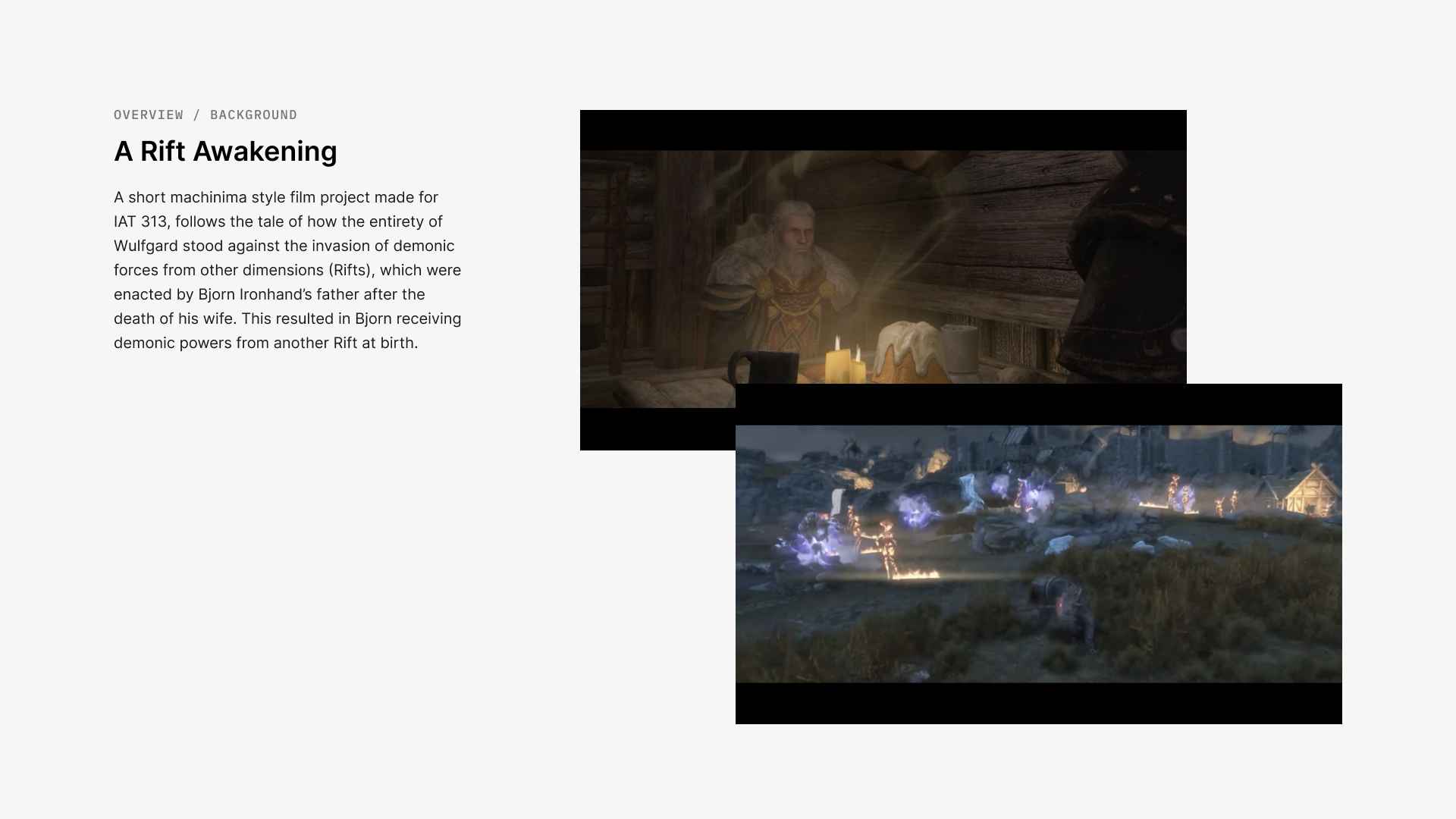
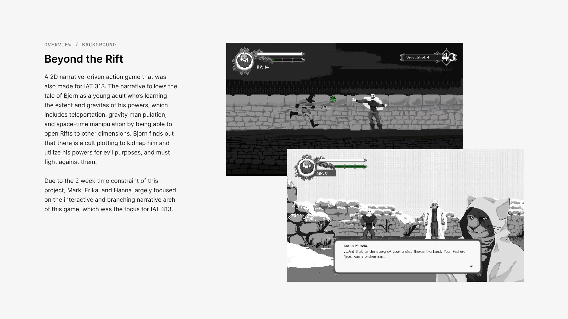
Reckoning of the Rift is a narrative driven 2D side-scrolling action-adventure game that challenges players' abilities to strategize for fast-paced combat and environmental obstacles. The game is the final installment of The Rift Saga; its narrative being a continuation of Rift Awakening (machinima), Beyond the Rift, and Legacy of the Rift. It follows the legendary Ironhand family—all of whom possess extraordinary magical powers—and the conflicts that they face in the world of Wulfgard.
The final deliverable of this project is a fully playable game with 6 playable characters, 3 main levels, 2 mini-bosses and one final boss.The final game can be downloaded here.
Project Objectives
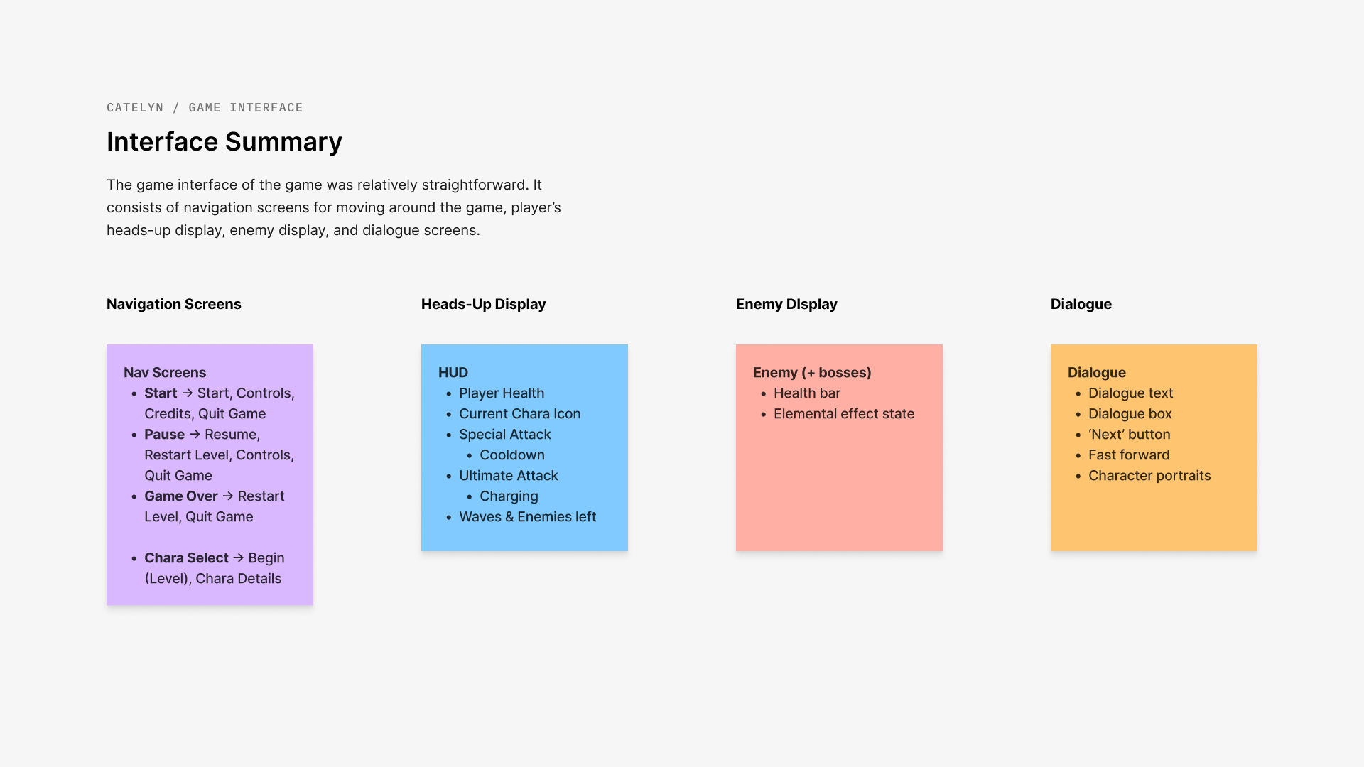
For this game, I designed the user interface , consisting of 13 different screens and overlays, including in-game navigation, player's heads-up display, dialogue screens, and a new party selection screen, as well as 60+ buttons and components.
Since this game is built upon previous games, so the objective was to optimize the UI layout in a way that does not disrupt the gameplay, while keeping it familiar so that returning players would not have trouble navigating the interface.
Screenshots from previous Rift Saga games: Legacy of the Rift (coloured), Beyond the Rift (black & white).
PART 1: UI Safe Areas
The first step in the interface design process was determining which areas were safe to be used for UI. The previous games had varying sizes of elements and no set UI areas, breaking the cohesion.
Using Figma to design and prototype the interface, I set up UI margins and safe areas on the top and bottom of the screen to keep key information uniformly within key areas.
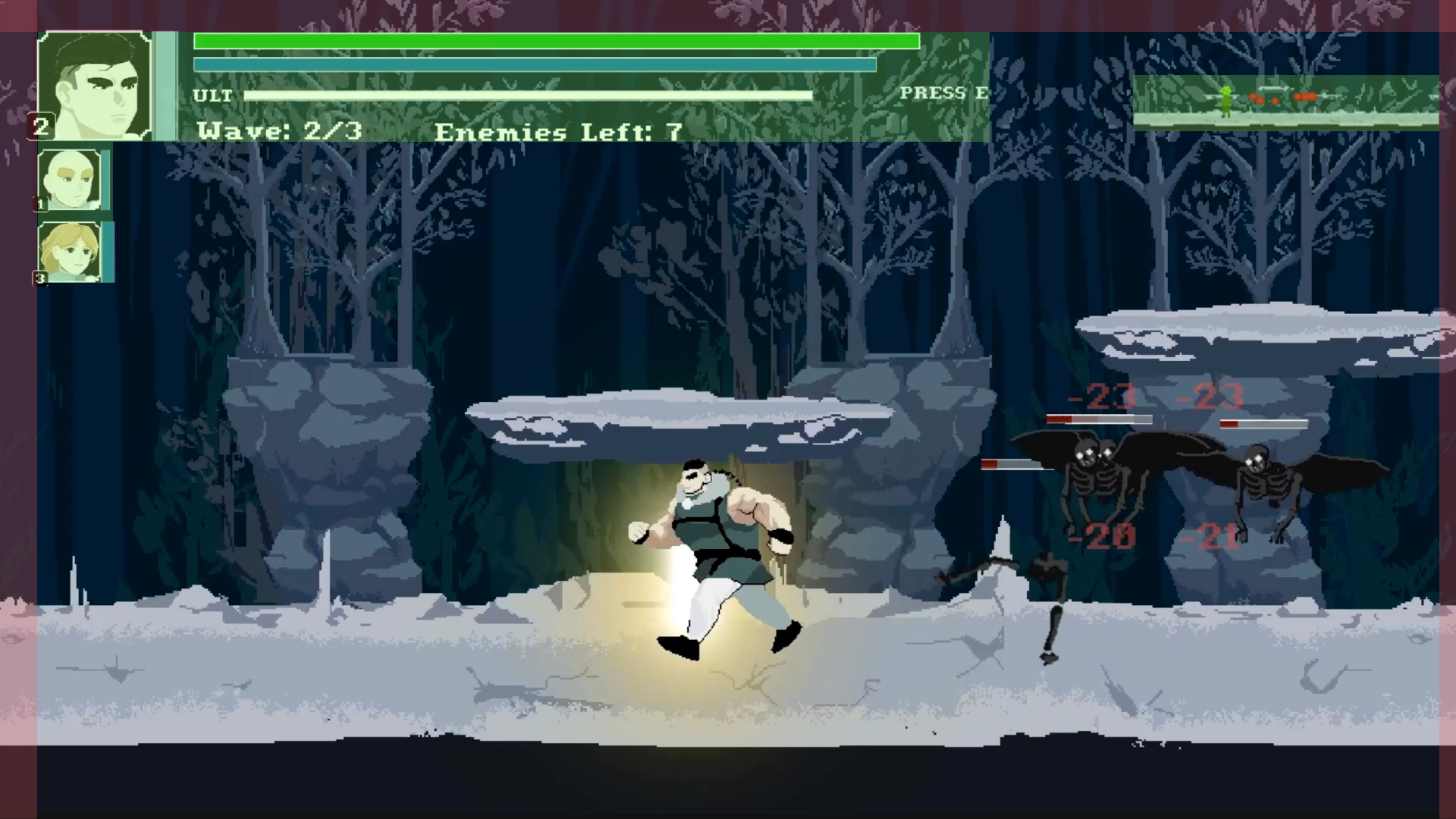
Picture of in-game UI from Legacy of the Rift. The previous games' interface took up varying amounts of space for UI elements and inconsistent margins.
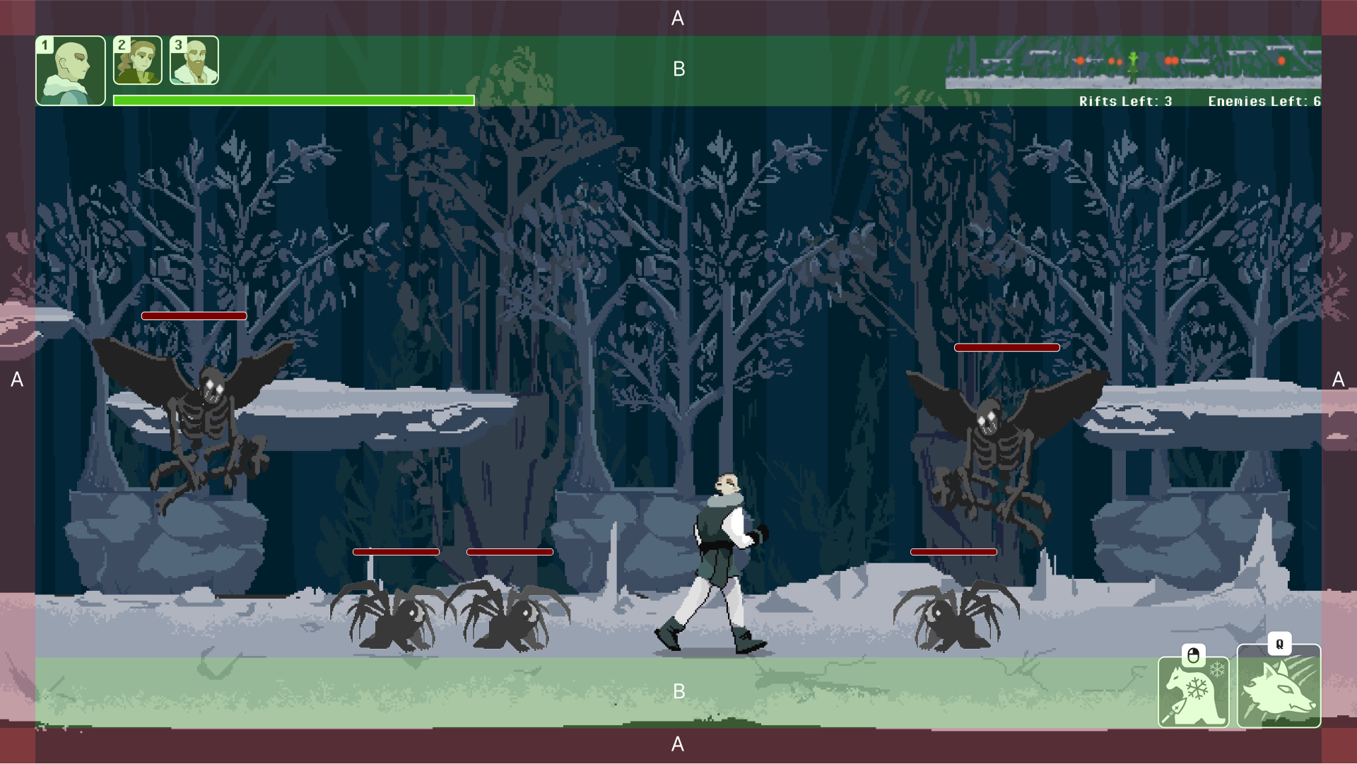
The new grid allows for all UI elements to be kept within set areas (A—margins, B—safe zones), and sets a basis for other screens.
PART 2: Heads-Up Display (HUD)
The Heads-up Display (HUD) contains key information such as player health, party members, and abilities. It is overlaid on any non-dialogue screen, making visibility and ease of understanding crucial. As such, I performed an A/B user test of the UI to guide the in-game UI decisions.
RESEARCH & TESTING
After researching the UI of other role-play combat games, I found that many newer games keep the HUD at the bottom of the screen, but the previous Rift Saga games had the HUD on top.
To gauge the user experience of both scenarios, I ran an A/B test of two Figma prototypes where the UI is either at the top or bottom of the screen. 75% of testers preferred HUD on the top as it was more glanceable, and the other 25% preferred HUD on the bottom as all interactive UI is together. Ultimately, we kept the HUD in the top as less users found it obstructive.
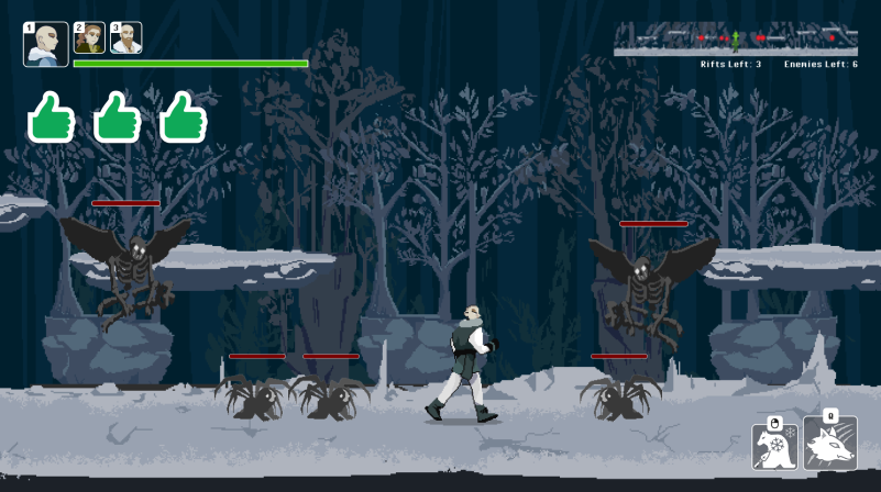
(Prototype A) Three testers preferred HUD at the top of the screen because it was easier to get information from one place (player health, enemy locations).
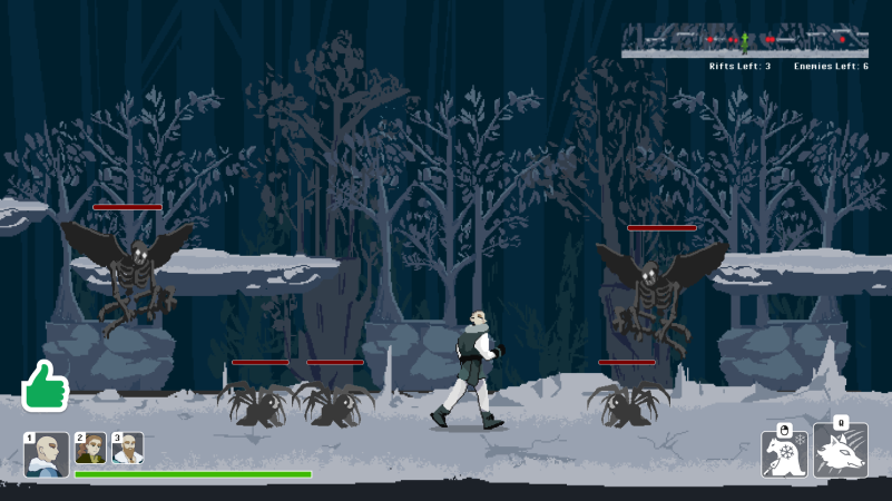
(Prototype B) One tester preferred HUD UI at the bottom so they wouldn't have to look at the top left and bottom right for interactive controls.
“I like that having the UI on top keeps it out of the way of enemies and all the other moving things to look out for on the bottom.” — Tester A
PART 3: Visual Cohesion
Lastly, I had to ensure that there was a cohesive and consistent visual language across all the screens, overlays and components throughout the game.
The icons and UI elements are used in different sizes and placements across screens, such as the Character Details, Combat, or Character Selection screens.
ICON DESIGN
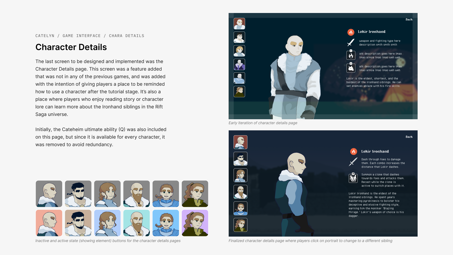
Character and ability icons were filled with translucent dark grey so players can see the contents without compromising the legibility when laid over different in-game backgrounds. In certain screens, such as Character Details, elemental powers were indicated using colours on the icon and element icon.
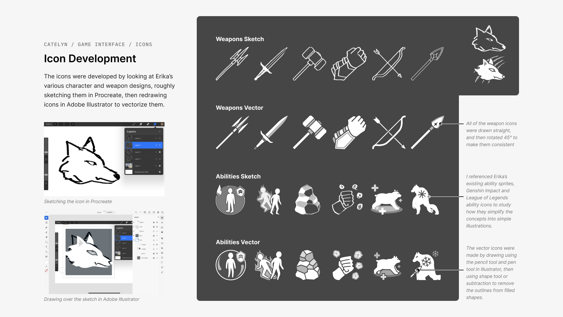
The iconography was first sketched in reference to the designs by my teammate Erika, before vectorizing them to be usable at different scales in various screens. Each icon was designed to correlate each of the playable characters to their abilities and weapons, helping reduce cognitive overhead for players and improve recognition and recall for quicker ability casting.
Compilation of UI elements (top-bottom rows): Character Detail icons, Character Select icons, Abilityicons, and Weapon icons.
Reflection
This was my first time working on game UI from ideation to launch, as well as my first time creating a design library. I found it challenging to design a non-intrusive UI that is both distinct from the pixel-style game elements, but also doesn’t look out of place with the game’s art direction. I also quickly learned about the game development process working on UI alongside code, and had to accept that some design decisions would not be implemented due to prioritizing core gameplay development over some UI elements and animations.
But overall, this project was a valuable experience that taught me to be adaptable, open to feedback, and how to be a team player working and communicating across teams!
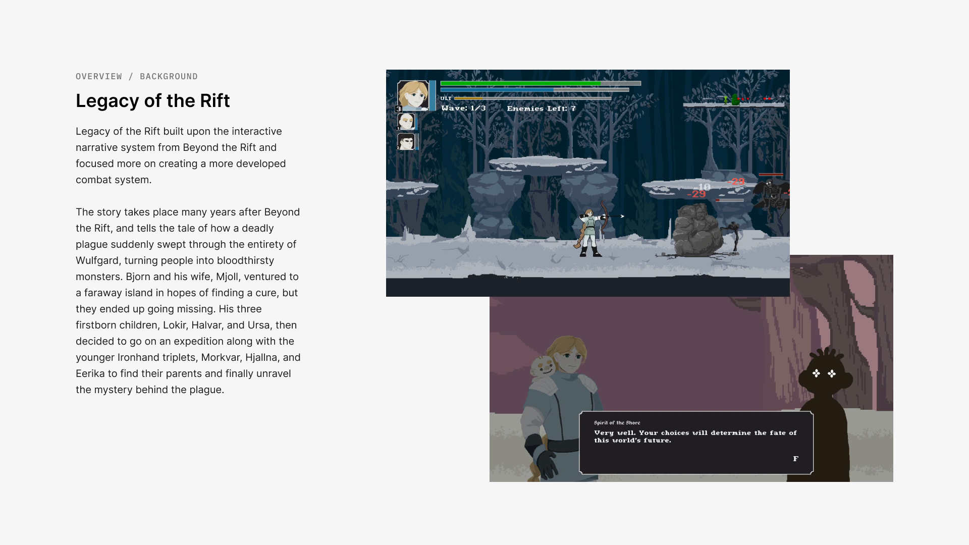
Finally, feel free to take a look at some of the slides below to gain a better understanding of the game's lore, narrative, and my icon design process. These slides were designed for presenting our game to industry mentors, peers and professors.
